 21
Feb, 2018
21
Feb, 2018
Typography in graphic design will be enormously important in branding this year. Again. Here’s why.
The reason typography reigns right now are largely due to UX constraints and the current trend towards responsive design, which dictates that everything must be easily scalable for different specs and platforms.
With this limitation here to stay, designers are rummaging in their bag of old-school tricks for new inspo – and they’re falling back in love with fonts.
Typography defined
Typography is the art of arranging type in design. Essential elements of strong typography include:
- Font choice
- Colour scheme
- Spacing (kerning – closeness of letters – and leading – closeness of lines)
- Hierarchy (what text is given weight and why)
- Formatting (bold, italics and underlining)
The typeface a designer selects and how they place words in a layout is crucial to visual impact, readability and sending the right message. Designers know this. They think very long and hard about it.
User experience and typography are closely linked. Having a fantastic UX necessarily requires a pared-back design where bells and whistles are removed. Often leaving only the text to play with.
Micro-trends in typography we’ve spotted:
Geometric sans serifs (that aren’t Helvetica)
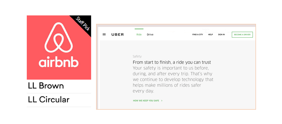
Until recently, the accepted thinking was that certain fonts are easier to digest in long blocks of copy – namely serif fonts like Times New Roman or Garamond. That’s all changed now with the rise of the new-wave Geometric Sans Serif fonts favoured by digital disruptors.
More and more well-crafted geometric sans serifs are becoming widely available. Prime examples are the ‘LL Brown’ and ‘LL Circular’ fonts used by Air BnB, and ‘FF Clan’ used by Uber.
‘There is a bold clarity and honesty to such fonts that have now been used by many large corporations to communicate the simplicity and openness that their brand team requires,’ says Lee Fasciani, founder and director of Territory Projects.
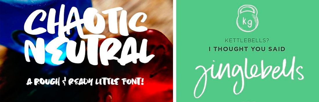
Hand lettering
You can’t beat the personal touch and artisanal appeal of a hand-drawn font (or indeed a font that looks like it’s been applied with a stamp pad like the below example). Beloved by hipsters and wine-makers, they add a touch of humanity to any screen.
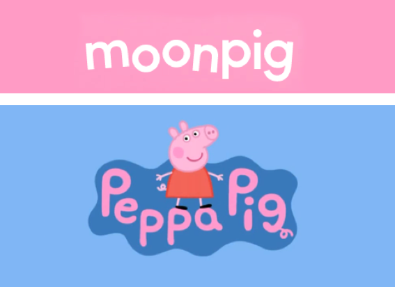
Creative spacing
Rotating letters a few degrees and playing around with kerning and leading are a surprisingly effective way to communicate a brand personality. Look at these zany pig examples below. Are they not imperfectly perfect!?
Negative space
A personal favourite of Sketch Corp, negative space type is all about leaving something out – even just one simple stroke – to create a whole new meaning.
Check out our Art Director Carolina’s logo for a new Brisbane property development. Something is missing. Or is it? Beautifully minimal and whisper-subtle. And the fact that evoke means ‘to conjure up a memory’ and you then are invited to ‘conjure up’ a ‘k’? Sublime.
![]()
Chaotic fonts
A close cousin of hand-drawn fonts, chaotic fonts are irregular on purpose. Letter heights and stroke widths vary wildly, imbuing any brand with a creative, free-thinking, expressive quality. Lorna Jane is a good example of a brand that uses chaoticism to great effect.