 02
Sep, 2015
02
Sep, 2015
You won’t believe how this one thing could quadruple your leads!
I’ll admit it. That was a bit of a smarty-pants trick.
But if you’re reading this, it means the enticing title worked. It made you curious, and it told you what you needed to do to find out more.
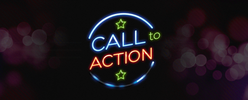
This month we’re talking about calls to action. And it’s true – adding a call to action to a webpage, flyer, or radio or TV ad could mean the difference between a failed promotion and a wildly successful one. Using the right call to action could in fact do a lot more than quadruple your leads. Seriously.
What’s a call to action?
Calls to action (or CTAs) are the little snippets of text that tell your customers or clients what they need to do: “Buy Now!”, “Call Us Today!”, “Click Here!”, and so on.
But while slapping a “Call Now” or “Get Your FREE Quote” on your mail-out will get you more response than not doing so, you’ll get much better results if you apply a little science (and creativity) to your CTAs.
Keep reading to find out how.
(Oh look, another CTA!)
Creating an effective CTA
You’d think that people would’ve become immune to the effects of CTAs by now, but time and time again, research and real-life reporting have shown that the CTA is still a vital part of any marketing or sales material.
Especially considering the Internet age’s constant barrage of information and sales messages, the CTA is more important than it’s ever been. Today’s CTAs are a far cry from their predecessors, with real-time A/B split testing, colour psychology, multi-device font design, algorithmic targeting and countless other techniques helping us squeeze that last 0.1% out of our advertising dollars.
What this means for today’s brands is that it pays to spend a little time creating, testing, measuring and tweaking your CTAs for the best possible results.
If this is something you’ve never given much thought to, don’t worry. Here’s Sketch Corp.’s quick intro to killer CTA development.

Keep it short and clear
People nowadays are busy, distracted and impatient. A good CTA should be short and clear – there’s no room for ambiguity.
If you had a button on a website telling you to “Contact Us”, you wouldn’t know if it was going to open up an email window, display a phone number, or link to a contact form.
Wouldn’t it be better if it simply said “Send us an email” or “Fill out a quote form”?

Make the design pop
Colours, shapes and sizes make a lot of difference when you’re trying to show your customers what you want them to do next.
Whether you’re using buttons or bold text, take a minute to consider if your CTA stands out. Does it blend in too well with the rest of the colour scheme, or is it too brash and tasteless?
A good way to test this is to choose colours that are at opposite ends of the spectrum (e.g. blue and red, black and white) and see how they look and perform. Then tweak it from there.

Be a little creative
If your brand has some uniqueness to it (or even if it doesn’t), think about trying something a little different to the standard “Call Now” or “Read More”.
We’ve talked before about having a voice and identity, and your CTA is just another place where it’s worth trying something new. Think about how Google has the “I’m feeling lucky!” button, or how more online companies are using wording like “Get started” or “Sign up with Facebook”.

Add some urgency
The fear of missing out (FOMO) is a real thing. This is how car manufacturers still get results from their “run-out sales”, and how you see “for a limited time only” and “while stocks last” every time there’s a promotion happening.
Using a little urgency can give customers that final little nudge over the line. For example, you could try a 15% discount that is limited to 20 people, with the number counting down with each sign-up. Eventually, it’ll say “only 2 left!!” or some other action-inducing warning.
 Remove risk and increase confidence
 Remove risk and increase confidence
No one likes clicking on stuff or stopping in the street for someone if they think they’re going to get signed up for something they don’t want, or if it’s going to eat up precious minutes of their day.
Your CTAs should be prefaced with simple copy that reduces customers’ fears and inhibitions, like telling them “Don’t worry – we won’t spam you with junk mail or share your details with anyone else” below a newsletter sign-up form.

Don’t give too many options
This goes back to the first point, but it’s worth mentioning again.
Keep your CTAs clear and easily understood! Don’t present people with a million buttons in different day-glo colours telling them to do all these different things!
Look at the Spotify, Twitter, Facebook or Uber homepages. They make it very simple to do one thing: sign up for free or download their app. They aren’t bombarding you with the gazillion different features they offer – that happens when you’ve already done the hard part.
Keeping in mind the above points, next time you’re on a website, watching a TV ad or listening to the radio, take note of how simple and clear their CTAs are. Who knows, it might make you less of a sucker for them, and it might also make you better at crafting them yourself.