 16
Mar, 2020
As of September, search giant Google will start ranking all websites by their mobile version, rather than desktop – meaning both new and existing websites will have to ensure they’re friendly and responsive for mobile.
Kicking off a testing period three years ago, Google has already reached the stage of using mobile-first indexing for more than 70% of the pages it displays in search results, and the plan to apply this across the ranking of all websites is just a few short months away.
Whilst Google is confident most websites are ready for the mobile ranking system, it’ll continue to crawl desktop sites with its traditional Googlebot – a function that may lead to site owners seeing increased Google crawling over the next few months. This will be carried out by two different crawlers – one representing mobile, one desktop.
What do friendly and responsive actually mean?
A lot of people assume ‘mobile-friendly’ and ‘mobile-responsive’ are the same – they’re not. This article has a good summary of what exactly’s meant by responsiveness:
“Responsive design is an approach to web page creation that makes use of flexible layouts, flexible images, and cascading style sheet media queries. The goal of responsive design is to build web pages that detect the visitor’s screen size and orientation and change the layout accordingly.”
The same article describes mobile-friendly, however, as:
“A website that’s easy to use on a mobile device, especially the small screens of smartphones.”
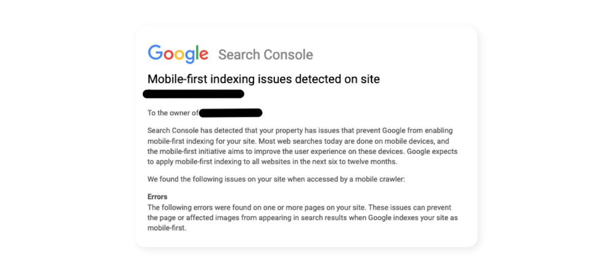
It’s important to be ready for Google’s shift to the prioritisation of ranking mobile-first websites. If your site isn’t yet mobile-responsive and friendly, Google might’ve already been in touch with a notice that looks a little something like this:

If you receive one of these and are unsure of what to do next, contact us today. If you’re not well-prepared for Google’s ranking of mobile-first websites when it kicks in, it may affect your own ranking – a problem we can easily help you with.
